The moment in 1939 when Dorothy Gale steps out of her monochromatic, tornado-tossed house into Oz’s richly saturated Technicolor world, her jumper transformed from checkered drab to blue gingham, her pigtails, cheeks, and lips taking on varying shades of red, is the moment most moviegoers associate with color’s first screen appearance. But they are wrong, by four decades.
For the first color film, you’d have to look past The Wizard of Oz and Gone with the Wind (winner of the first Academy Award for color cinematography), Walt Disney’s 1937 animated feature Snow White and the Seven Dwarfs, 1935’s Becky Sharp, the first feature-length Technicolor film and the final sequence of the Academy Award-winning House of Rothschilds or La Cucaracha (the first fully color short film). You also have to warp back before the talkies into the silent era to 1922’s The Toll of the Sea (starring Anna May Wong), by which time the six-year-old company had licked a projection problem, but not the “blue” problem (you can see what red-and-green Technicolor Process 2 looks like in 1927’s Technicolor Fashion Parade). You’d have to travel back further still to 1919’s gel-lighting projection system that D.W. Griffith patented for Broken Blossoms and the Handschiegl coloring process, which debuted in 1917 with the burning-at-the stake scene in Cecil B. Demille’s Joan the Woman.
For color’s cinematic debut, you have to go all the way back to the medium’s very inception, back to that famous night the Lumière Brothers demonstrated their Cinématographe at the Grand Café in December 1895. Among the actualités on the program, at least one, Les Forgerons (The Blacksmiths) is known to have been hand-colored, frame by frame, for its brief but entire duration. Whether or not it was in color that night is unknown but some film surely was, according to an account posted in Le Radical: “[Y]ou see them again natural size, in color, with perspective, distance, skies, houses, with a perfect illusion of real life.”
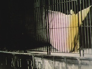
That same year, Thomas Edison’s moving image experiments included capturing Annabelle Whitford doing the serpentine dance first made famous by Loïe Fuller. (Watch the 1895 Serpentine Dances, directed by William Heise, an Edison employee.) The original dance was done on a stage by Fuller dressed in flowing white gowns that reflected colored spotlights as she fluttered about. French dancer Madamoiselle Ondine upped the ante by performing the popular dance inside a lion’s cage for a French production company in 1900. In Danse Serpentine, amber-coated lions and orange-striped tigers dart around under a trainer’s whip before the dancer’s arrival in a stunning display of naturalistic color. Alice Guy’s dance films also often came multicolored, from 1900’s Pierette’s Escapades to 1905’s The Tango.
In May 1896, during the first occasion when audiences could collectively watch a film on a single movie screen, actors May Irwin and John Rice re-create an intimate kiss from the final controversial scene of the stage play The Widow Jones, she wearing pick, he sporting a deep-blue suit jacket. (You can watch the black and white version here.) The New York Times reported the next day, “Edison’s Vitascope has made a sensation at Koster and Bial’s, and promises to remain for a long time on the bill. It showed its pictures in colors last night, and was applauded vigorously….”
That more of us aren’t aware of cinema’s colorful origins is the result of a pragmatic approach to film preservation taken by the earliest archivists. In his introduction to Joshua Yumibe’s Moving Color: Early Film, Mass Culture, Modernism (Rutgers, 2012) Paolo Cherchi Usai writes, forgivingly, “The cost of color film stock was prohibitive, and there was not enough money to deal with the staggering amount of nitrate prints to be saved. Moreover, there was an acute awareness that modern color negatives and prints were subject to irreversible fading, while black and white preservation material had a better chance to remain relatively in tact … Make no mistake: if early films hadn’t been saved without color, there wouldn’t be so many of them available….”
Forgiving is easy, especially knowing that a mere ten percent of movies survive the silent era at all. It becomes even easier to forgive, now some of the remaining films are being restored to their original, colorful majesty.
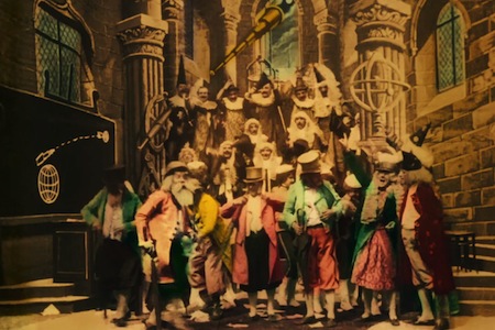
It’s hard to find a better example of hand-colored spectacle than Georges Méliès’s iconic A Trip to the Moon. The columns in the grand hall of the debating scientists are gilted in gold, and each man wears a suit of a different color; because of the color you can even sometimes detect differences in fabric. A green velvet coat certainly makes a bigger impression and colorful costumes prevent the men from merging into a morass of old white man sameness. The mushrooms in the moon cave are more alluring, the lunar demons more menancing in red, and the celebration at the end is much more festive with multicolored flags and banners. The most significant difference for me between the black-and-white and color versions is what happens to the poor moon when the spaceship unceremoniously makes its squishy landing. I had always interpreted that ooze as a kind of soft-cheese joke made by Méliès (he is French…). But in color, the ooze is blood. These men have pierced the lunar surface; they’ve hurt the moon. That is another kind of joke entirely and the demons who later appear seem quite justified in chasing off the intrepid explorers.
In Hugo, his 2011 digital homage to the cinema pioneer, Martin Scorsese gives us a taste of the colorful worlds Méliès had conjured. He reimagines the Kingdom of Fairies set in a magnificent tableau of azure, pink, and yellow. Méliès had found, however, that he could only use shades of gray during production. “Colored sets come out very badly. Blue becomes white, reds, greens and yellows become black; a complete destruction of the effect ensues,” the pioneer explained in a 1907 article, “Cinematographic View.” Costumes and objects, too, could only be gray—which paints a much drabber picture of life inside Méliès’s glass studio.
Méliès outsourced the tedious work to Elisabeth Thuillier, whose expertise came from her years hand-coloring lantern slides. Thuillier had a thriving business, employing more than 200 workers (largely female), who treated each film and each release print of a film, frame by frame, using a brush of a single horse hair to apply color when the area was small enough. Méliès stuck to hand-coloring through 1912, even after the rest of the industry had moved on. French studio Pathé is credited with refining a less artisanal more industrial way to apply color by which stencils are cut for a single film title, one for each color to be applied. Gaston Velle’s The Talion Punishment is one example. Distinguishing stenciling from hand-coloring is only possible, as scholar Yumibe writes in Moving Color, by examining the entire frame from a film, where stencil marks are sometimes evident.
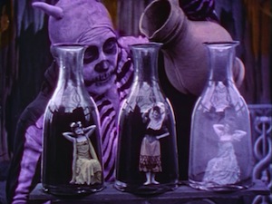
Stenciling was the dominant way to apply color by the end of the aughts when Segundo de Chomón became the chief colorist at Pathé, credited with refining the process. Having proven an able artisan hand-coloring many Méliès films for distribution in his native Spain, Chomón’was invited by Pathé to set up shop closer to its production facilities to help the French studio keep up with international demand. (Sending prints to Spain from Paris for coloring is not so far as you might imagine. The American company Selig Polyscope negotiated with Méliès to have its prints shipped across the Atlantic to be colored at Thuillier’s Paris operation.) The Red Spectre is perhaps Chomón’s most famous stencil-colored film, a demon who shifts from red to purple with the power to conjure women dressed in various pastels and then levitate them on an altar of gold.
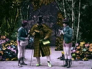
Other films used color only sparingly, such Edwin S. Porter’s famous The Great Train Robbery. A payroll box is blown open in a burst of orange and pink, a girl in a magenta frock panics after finding her father shot on the train station floor, and in the grande finale, the black-and-white shootout is punctuated with bursts of orange-tinged gunfire.
Color films were in demand and, as they cost more to produce, fetched higher prices. Edison’s Jack and the Beanstalk (1902) could be purchased for $93.75. For an additional $140, the film came in complete color; a version with only the figures in color and the beanstalk tinted could be had for an extra $85. You can watch the least expensive version here.
By 1912, films were getting increasingly longer, so hand-coloring and stencil-coloring were no longer feasible. In the two subsequent decades, color films usually looked something like the segments at the beginning of The Wizard of Oz. Those early scenes on the farm—the encounter with Miss Gulch and Professor Marvel, the singing of “Somewhere Over the Rainbow” and the tornado sequence—are actually sepia-toned. Toning is another additive process whereby color is applied to the darker parts of emulsion. It was often done in combination with the tinting of prints, dousing sections of a print in a bath of browns, reds, blues, greens, or yellows. While a film like Mauritz Stiller’s Sir Arne’s Treasure (1919) would certainly be effective in black and white, its ice-entombed world seems somehow colder and more forbidding with the blue tinting applied. From the short puppet film The Camerman’s Revenge (1912) to the feature-length narrative The Birth of a Nation, from Louis Feuillade’s spooky serial Fantômas to the mystery thriller The Cat and the Canary from 1927, color had become so standard that some manufacturers marketed pre-tinted film stocks.
Yet the holy grail for color cinematography was always what is called “natural” photography. Much as sound in cinema was not considered fully formed until it could be synchronous, technicians grappled with capturing color in-camera. Britian’s Kinemacolor had come closest to achieving natural color with a joint photographic and projection technique, but only could harness red and green. Technicolor finally achieved full-color cinematography with its Process 4 (which photographs in red, green, and blue in the camera, making a full palette of color possible), first seen in Disney’s 1932 Flowers and Trees and made indelible in The Wizard of Oz. The company and its color consultant Natalie Kalmus came to dominate the look of American cinema in the 1940s.
But that turns out to be just another piece of history in need of revision. In March 1899, London photographer Edward Raymond Turner patented his own natural color process. Surviving footage from a set of 1902 films shows Turner’s three children at a table in the garden of their home in Hounslow, jousting with sunflowers, goldfish swimming in a fishbowl. Turner was unable to perfect the technique before his untimely death from a heart attack one year later but modern archivists uncovered the footage (and notes for the process) at a science museum in Bradford, England. They worked out a kink in the process, proving that Turner’s system would have worked with the technology available at the time. You can watch the test footage on the Telegraph website. The footage of Turner’s oldest daughter on the garden swing surrounded by verdant English shubbery recalls the palettes of the finest impressionist paintings, and the verisimilitude of the macaw’s red, green, and blue feathers astonishes more than a century later.
Of all the misconceptions of silent-era cinema that linger—its silence (screenings almost always featured live music, sometimes sound effects) and the most excreable canard resulting from projectors running too fast—that it was solely black and white may be the hardest to correct. As Yumibe states, in a much less forgiving tone than used by Paolo Cherchi Usai, “[M]any archivists believed that applied color was a non-photographic, and thus unessential, addition to silent film, and its preservation was therefore unnecessary.” In other words, we don’t get it, so let’s forget it. We almost did.
Shari Kizirian is a freelance writer and editor. She coedits the San Francisco Silent Film Festival program book.