
The first thing you notice is texture: fabric swatches, wallpaper, cardboard, poster rolls, holographic foil—not their color or pattern or design but the way these objects look like they might feel. In the films of Jodie Mack, the content of an image is no more important than the material on which it’s printed, and as a result the aesthetic pleasure afforded by the experience is just as much tactile as visual. As the production and dissemination of images becomes an increasingly digital effort, are we forgetting what it means for an image to have presence? As if in response Mack’s films ground bursts of psychedelic animation in something physical and real, something you feel you could reach out and touch. You’re made aware of the substance of the image, its materiality, its objectness. You’re made aware that the image is not some purely abstract concept but a thing. You’re made aware that the image is present, like a fresco in which the plaster is as much the focus as the paint. In a sense these shorts are not so much collections of images as documentaries of them, portraits of light and color with an unexpected emphasis on the frame.
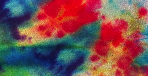
Consider Undertone Overture, one of the new shorts presented in the five-film Jodie Mack program at this year’s International Film Festival Rotterdam and a representative sample of the director’s approach to image-making. Undertone Overture presents what appear to be thousands of tie-dyed squares of cotton cycled through rapidly, the variety and velocity of which abstract the colors until they appear veritably kaleidoscopic. Over time, sinking into the rhythm of the montage, a kind of persistence of vision effect kicks in, and the static, unrelated tie-dye images begin to resemble a continuous animation, as if you were watching a swirl of technicolor waves wash over the lens—an impression helpfully reinforced by the din of ocean sounds that forms the film’s score. But there’s more going on here. You never get the impression, watching Undertone Overture, that what you’re seeing is simply color in and of itself: the texture of the image is too conspicuous to ignore. What you’re seeing is not tie-dye color but tie-dyed material—cotton, hemp, rayon, each cut showing differences not only in the swaths of bleeding colors but in the surface qualities of the fabric. Shot top-down in closeup on 16mm film, Undertone is precisely (and uniquely) attuned to how this material looks and feels, restoring to the abstraction a sense of belonging to the physical world. You are overwhelmed viscerally. But you know exactly what you’re looking at.

It’s significant, I think, that Undertone’s choice of material is both commercial and antiquated—the two qualities to which Mack most regularly gravitates. New Fancy Foils, a twelve-minute short from the same series in Rotterdam, takes as its textural focus excerpts from discarded wallpaper sample books, swapping out one gaudy vestige of decades-old popular culture for another and homing in, once more, on the tactile qualities of a very tacky thing. Naturally, flipping through spreads of checkers, polka dots, and paisley patterns like a coke-fueled interior decorator creates an effect considerably less psychedelic than the one sustained by Undertone Overture, perhaps in part because, even at its most abstract, the presence of this material is always immediately apparent. New Fancy Foils isn’t simply about the wallpaper it displays; more specifically, it is about displays of wallpaper, catalogued and arranged for interested perusal and commercial sale. A variety of meanings can no doubt be derived from all of this, but I’m especially fond of Phil Coldiron’s reflection in Cinema Scope that New Fancy Foils represents a sort of rejection of traditional market pressure: Mack here stages an “artistic intervention” between consumer and product, retaining the pleasure of the images while removing the need to buy them, leaving a “hypothetical female shopper to experience only these roiling pleasures of color and movement.” It’s a reappropriation of commercial iconography—the image is an object, but not one being sold to you.

It should come as no surprise that another long-lost remnant of pop culture ephemera forms the basis of Mack’s Glistening Thrills: this time it’s holographic foil, that shiny color-refracting stuff from which practically every sticker, poster, business card and wrapping paper tube was made during the height of its popularity in the mid-1990s. Today this novelty item is as scarcely seen (and instantly embarrassing) as the tie-dye tee, so of course it’s the perfect material for Mack to creatively salvage. Well, in Mack’s hands foil proves plainly dazzling once again, and in fact in aesthetic terms alone Glistening Thrills ranks as perhaps her most exhilarating found-object work; its interplay of light and color, often totally hypnotic, produces an effect unlike anything I’ve ever seen. Though it doesn’t exactly accomplishing anything conceptually or thematically that isn’t covered by the two earlier shorts, its concise expression of these ideas combined with its breathtaking formal qualities make it in some ways the definitive installment of this series. The story it tells is one with which Mack seems fascinated: A mass-produced commercial product rose to ubiquity, slumped into obsolescence, and has long remained forgotten. From this she sees an opportunity to restore it before our eyes—to make it seem new and wonderful again, to transform it into something beautiful.

This last point is worth stressing: the films of Jodie Mack are above all else exceptionally beautiful works. For all their intellectual depth and richness, perhaps their most valuable quality is in how they aspire to render ordinary objects as completely, utterly extraordinary. Let Your Light Shine, Mack’s shortest film and the one least obviously connected to the thematic points illustrated above, is one of the greatest avant-garde works I’ve ever seen for the simple reason that I’ve rarely seen images so sublime. A three-minute “photokinetic stroboscopic spectacle” comprised of simple white-on-black animation and designed to be seen wearing special glasses, it’s a film whose greatness I can’t begin to describe here. So I’ll leave it at this: there is a lot of valuable criticism that can be directed at the films of Jodie Mack, a lot of meaning and import than can be extracted and worked through. Hers is clearly a cinema of ideas. But at its best her work defies elucidation in the usual sense; for whatever reason, I can’t articulate the reasons for affection. In this one short light alone is the object, the thing. And light is more than enough.