
A question not asked often outside of technical circles and within specific niches of Oscar campaigning: How well does a film’s editing style align with its overall visual aesthetic? Often when we refer to a film’s rhythms as “jazzy” or “stately” we do actually feel that this vibe is in somehow in synch with an overall design also evident in choices made about mise-en-scène, cinematography and production design, even if it’s difficult to articulate how the flow of cinematic space and time relates to the more purely pictorial aspects.
This is made more complicated by frequently utilitarian imperative of editing, even in films where other craftspeople have been permitted a very free or faddish hand in their choice of angles, lenses, lighting, costumes and décor, etc. Certainly Elio Petri’s The 10th Victim, from 1965, is for long passages assembled into a purely unobtrusive continuity. But every cut is a choice, and many of the choices made in The 10th Victim seem guided, like the rest of the film, by the tenets of Pop Art.
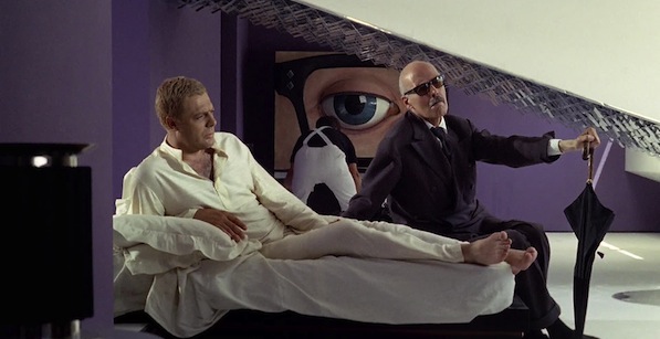
The 10th Victim is set in one of those dystopian futures in which humanity’s depravity is given as the reason for the existence of the contrived violence we ourselves are paying to see. In this case, it’s the “The Big Hunt,” a computer-regulated societywide cat-and-mouse murder sport, which channels violent impulses into celebrity-culture spectacle. Both our protagonists are introduced making their kill in public: Ursula Andress, with fembot brasierre-gun as the climax of a striptease, and Marcello Mastroianni, blowing up a competitor at a horse-jumping competition. The dystopia is also, quite naturally, commercial: the film centers around Andress’s efforts to lure Mastroianni to his death in front of TV cameras and dancing girls in mod go-go dresses, as part of a special message from her corporate sponsor, Ming Tea.

The film is a work of Pop Art in that it parodies, celebrates and embodies modern industrial society’s idolatry of consumer products. The line between pointed appropriation and in-kind simulation is appropriately thin. (Roy Lichtenstein, discussing his re-created comic panels in a 1966 interview, observed, “Sometimes you get a very interesting image that would almost be good by itself except that this was not the artist’s intention.”) The décor is lavishly commercialized. The look is white and streamlined, futuristic and machine-tooled: glass and chrome surfaces, characters of both genders dressed like sexy flight attendants, and rooms decorated with cube-shaped furniture and bizarre art objects (notably, Mastroianni’s home features dozens of full-body plaster casts tossed around like accent tables). Like the comic books favored by Mastroianni’s character—supreme Pop Art originals—Petri poses his actors for high- and low-angle tableaus, or in frame-filling close-ups, advertisements in search of a product.
So how is all this reflected in the editing? Well, it isn’t, always, but when it is, it’s very suggestive. Petri frequently opens scenes on close-ups of objects, rather than establishing long shots, and often with the rhythm of a match on action. And characters are likewise often introduced into a scene with a close-up. When Mastroianni’s ex-wife Lidia interrupts a mid-movie love scene, Petri breaks the rhythm of romantic close-ups not with a long shot for Lidia to arrive in, but with another close-up, privileging the immediate impact of her face over more classical concerns with spatial orientation.


The opening credits make especially dynamic use of close-ups, as one element in a rhythm of visual contrasts as extreme as the black-and-white mini-dress Andress sports (along with a raven wig) during the sequence. The heady juxtaposition of extremes creates a collage effect.
In this opening scene, Andress lures her hunter around the streets of Manhattan, in and out of crowds and along the sidewalks below skyscrapers that make a visual rhyme with the finale in the shadows of Rome’s Coliseum. These shots, taken with an extremely wide-angle lens, are broken up with cutaways to very flattened, shallow-focus telephoto close-ups of a man explaining the rules of The Big Hunt. We can’t see his surroundings; the camera, as it does throughout the movie, moves with him, keeping his head centered in the frames.


As he exposits, he takes on the aspect of a TV pitchman, locking eyes with us at every cliffhanger break in the breathless action. His head is disembodied—unmoored from any spatial context. This makes the close-ups iconic, in the sense of Pop Art’s icon-making, those devotional frontal views of the famous and pseudo-famous, both equally larger-than-life, Lichtenstein’s blondes or Warhol’s silkscreens and screentests of false gods, both people and products. (It is fun to notice that Mastroianni’s character owns a wonderful piece of Pop Art, a huge close-up of a blinking eye which plays on a video loop in his apartment.)
During the chase and shootout of the opening credits, which seems to move from Midtown to the Financial District, not continuously (under the Brooklyn Bridge, Andress runs out of the frame’s extreme right foreground, and in the next shot is running straight at the camera with Trinity Church in the background). With the ease of a channel surfer or magazine clip-artist, Petri grabs what he likes from the visual noise of the modern urban environment.


My other example is a film very deliberately removed from the city, and indeed from contemporary society itself. Water Wrackets, one of Peter Greenaway’s early experimental short films, matches shots of rivers, streams, ponds and lakes with a fanciful, Tolkein-inspired voiceover, describing obscure dynasties, military engagements and feats of civil engineering. (“At Forkmeeter in 12478, the Wracket Dispersal had reached the first limit of its bounding eastward rush. Sackett and Mesander had seen it through the Bowring and the Allow had organised the First Continuance. In the second quarter of 12477, Harteaster succeeded Sacksettor and the Marcream of Greable started the plunder of Piercing, Settle, Fastnest and the headstreams of the black reach of the Nadder. Greable’s third son, Agateer, reached Pressing and Brindle in the first thaw of 12476. In the second quarter of that year, his Wracket Elite approached the Wardour Basin.” And so on.)
The footage consists entirely of shots of the invariably depopulated English countryside, frequently stock-photo-like in its picturesque neutrality. There are sound-image matches which give the short the feel of an educational documentary: as the narrator tells us about “The Winter Lake” (“up until 11632, its margins bristled with palings and its guard wore blue-dyed goose feathers and carried cordrush stiffened with gum”), Greenaway gives us a series of shots of icy surfaces and frost, as if we’re patient schoolchildren imagining along with a lesson about the history of a now-nondescript place. But the assertive matches feel ironic: the made-up military history—and indeed vocabulary—make any correspondence seem absurd.

This fundamental divergence from representation is, in fact, part of the film’s visual style.
Greenaway is a filmmaking closely associated with painting, and particularly interesting for our purposes here is a line of reasoning pursued by David Pascoe in Peter Greenaway: Museums and Moving Images. J.M.W. Turner, in paintings like Rain, Steam and Speed—The Great Western Railway, “where the smears and smudges of the oils reproduce water, steam and velocity,” as Pascoe says, demonstrates the painter’s art of “captur[ing] evanescence,” and indeed Turner’s proto-Impressionistic brushwork expresses a tactility that becomes its own subject, even in a nominally figurative painting. Pascoe goes on to describe an oil and collage work of Greenaway’s, from 1974 (a few years before Water Wrackets), which “exploits optical possibilities: the mesmerizing power of a tantalizing pattern or grid lines fading and disappearing just off the canvas.” The description of surface as content is very important to Water Wrackets, which similarly explores a visual interest in “a tantalizing pattern or grid lines fading and disappearing just off the” frame.

Much of Water Wrackets is simply close-ups of water, with light playing off its ripples as it flows or stills along grass and below branches. A preponderance of shots are tightly framed, with the water rushing through and around the on-screen space. Each shot is less a unit of information than an object of contemplation, as tenuously grasped subtleties of light and movement become our primary interest. Greenaway’s military mock-epic, like Turner’s nautical paintings, is in fact primarily a visual study of effervescence.
Too, in the editing of the film, Greenaway is less interesting in geography than in patterning, alternating shots of water flowing screen left-to-screen right and vice-versa, and interrupting rapid-fire close-ups with restful long shots held an extra beat. When Greenaway moves in and out of close-up, it can be as disorienting as moving from a “detail” view, to seeing a canvas whole.
Mark Asch, for several years the film editor of The L Magazine in Brooklyn, is currently a Master’s student in Reykjavík.