Another month, another batch of awesome movie posters! We are knee-deep into the Fall Festival Season and with so many new movies debuting at places like Telluride, Venice, TIFF, and the upcoming New York Film Festival we had a lot of amazing posters to choose from. Here we revisit a movie we previously covered, revel in some good ol’ frontier horror, and marvel at not one, but four posters of a single movie. So sit back and enjoy the wonder that is September in movie posters!
At Eternity’s Gate
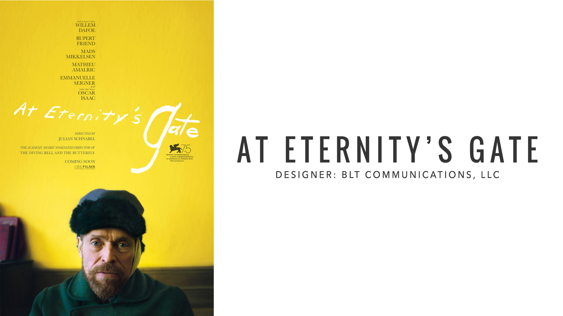
Director Julian Schnabel has a thing for making movies about artists — see Basquiat, Before Night Falls, and The Diving Bell and the Butterfly — so this little movie about Vincent van Gogh seems like a match made in heaven. Throw in Willem Dafoe as van Gogh (the role he was basically born to play) and this has “Oscar bait” written all over it. The poster itself may be simple, but it nevertheless features some cool “design-y” elements. For example, the bright yellow wall stands in for the artist’s ecstatic color palette, and the title treatment mirrors van Gogh’s signature. What is most interesting, though, is how little of the poster Dafoe’s van Gogh occupies. He’s compressed in the bottom centre of the poster. This arrangement can be interpreted in a number of ways: It at once feels as if the weight of the world rests on van Gogh’s shoulders, reinforced by Dafoe’s mournful gaze toward the camera, and also as if the breadth of empty space above him represents the grand scope of his paintings, reflected by the bright yellow dominating most of the image. The poster, taken as a whole, reflects the duality of ecstasy and pain present in van Gogh’s life and work.
Watch Now: Basquiat by Julian Schnabel.
The Favourite
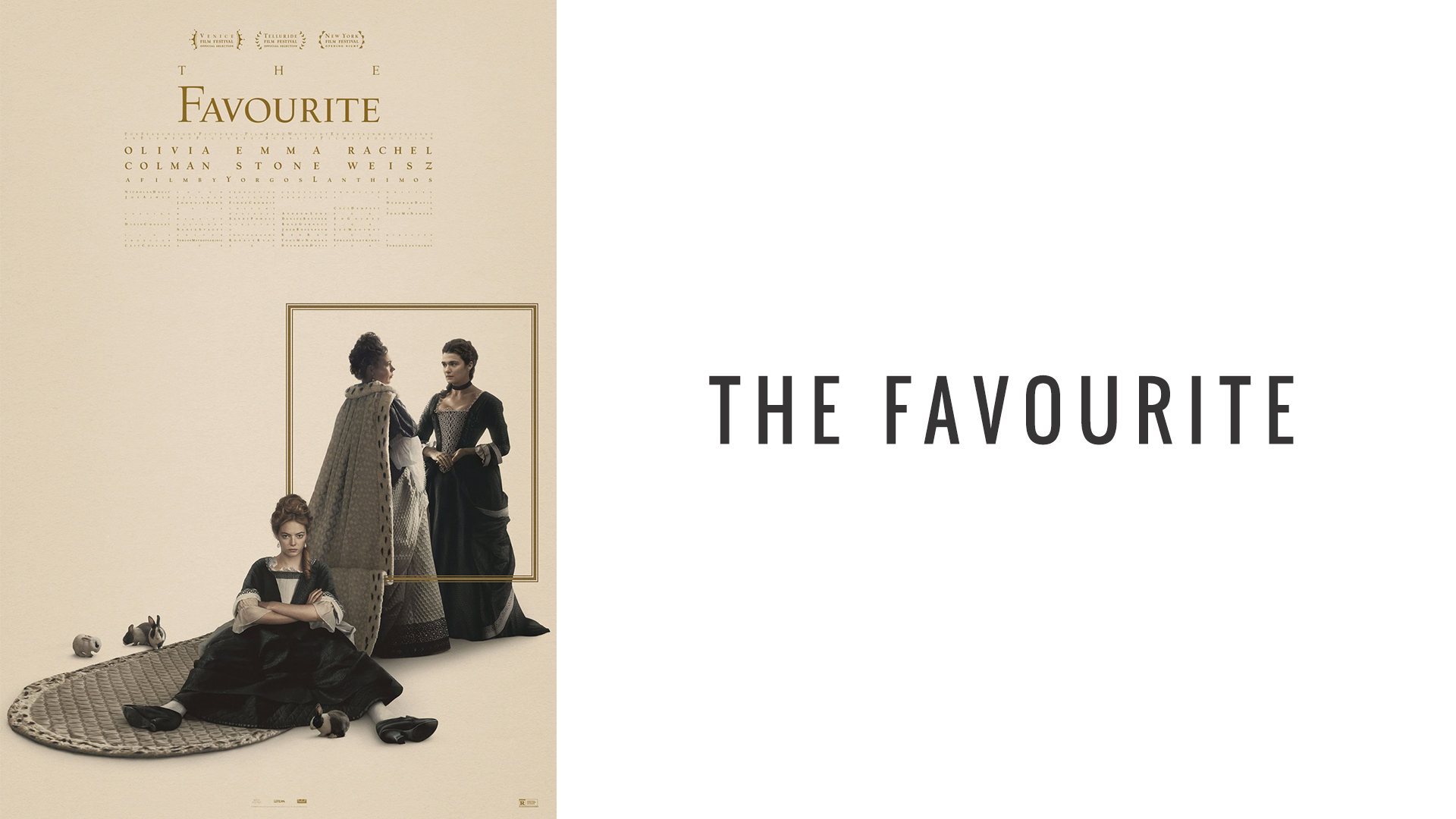
We covered The Favourite’s teaser poster in a past edition of Fandor’s Favorite Movie Posters, based solely on how it arranged its text. Now they’ve finally dropped the official poster, and it’s pretty darn cool. We especially love the arrangement of the movie’s three stars, Olivia Colman (who should just get the Oscar right now), Rachel Weisz, and Emma Stone. Stone occupies the middle-center of the poster, suggesting that her character might also be at the center of the story, yet she is definitely on the outside looking in when it comes to the relationship between Colman and Weisz’s characters, who very literally stand on the other side of a portal. This square portal, which hangs magically between the characters, suggests a mirror, through which Colman has stepped. This could represent madness or a detachment from reality; she is, very literally, “through the looking glass.” Even so, the fact that the train of her robe hangs on the other side of the frame could symbolize the tug of war for her affection between Weisz and Stone’s characters, as well as her having one foot in the real world and one in the world of madness.
The Front Runner
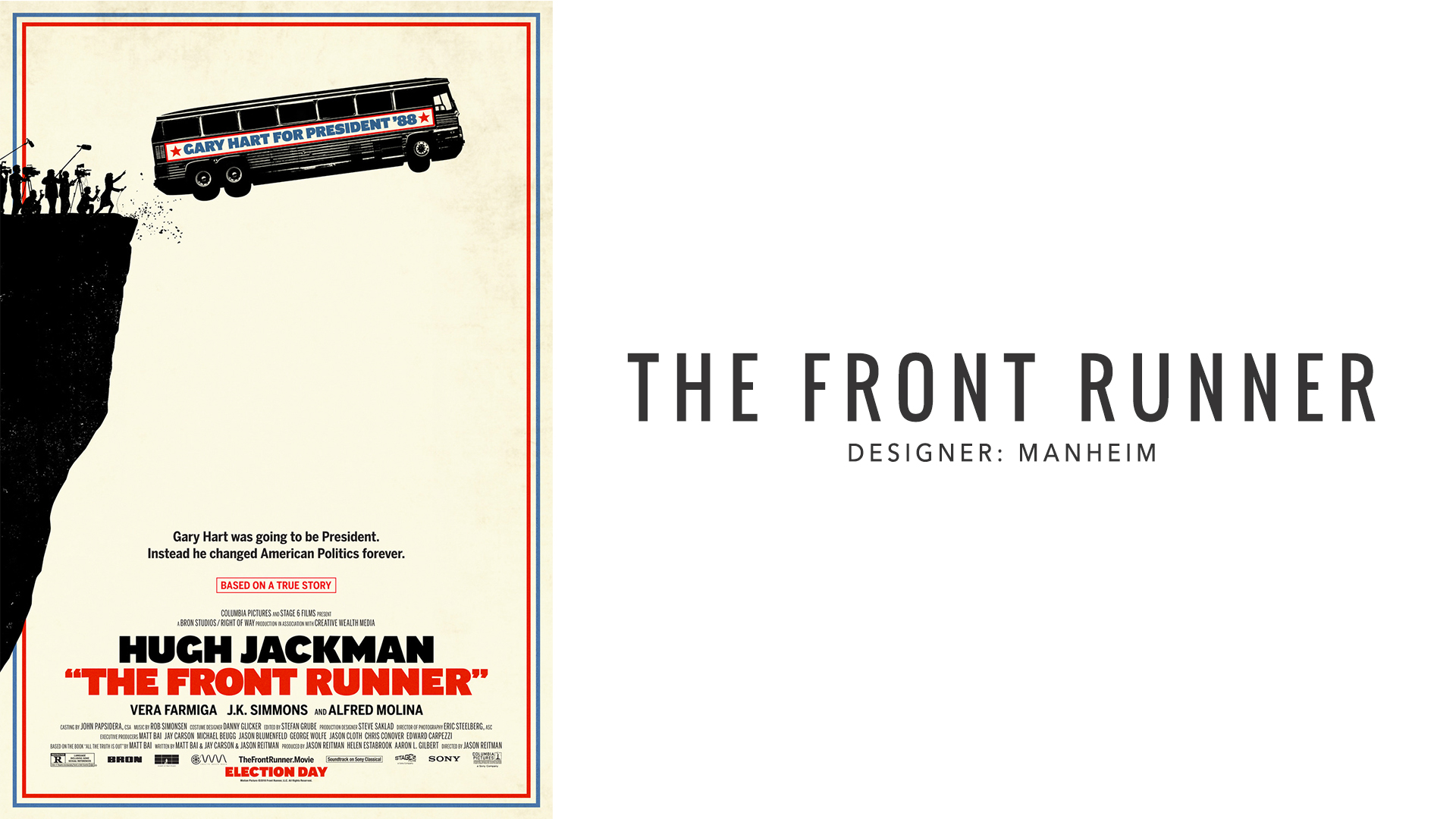
What do you call a bus full of lawyers at the bottom of the sea? You know how that joke goes, and there’s likely a similar one for politicians. Now that’s out of the way, there’s a lot to like about this poster: The heavy black of the cliff face, reporters, and lines of the bus give it a woodcut aesthetic. It’s also interesting how the nearly-solid black of the cliff disrupts the blue and red frame; this gives it the impression of a polaroid, a snapshot of a moment that began out of frame. It also potentially symbolizes the corruption of American ideals, as the image literally breaks through the outline and its patriotic color scheme. The titles are made in heavy bold letters with quotations around the title, which both harkens back to certain posters of the 70s and 80s and serves as a subtle wink to the audience that Hugh Jackman’s character is not really a front runner at all.
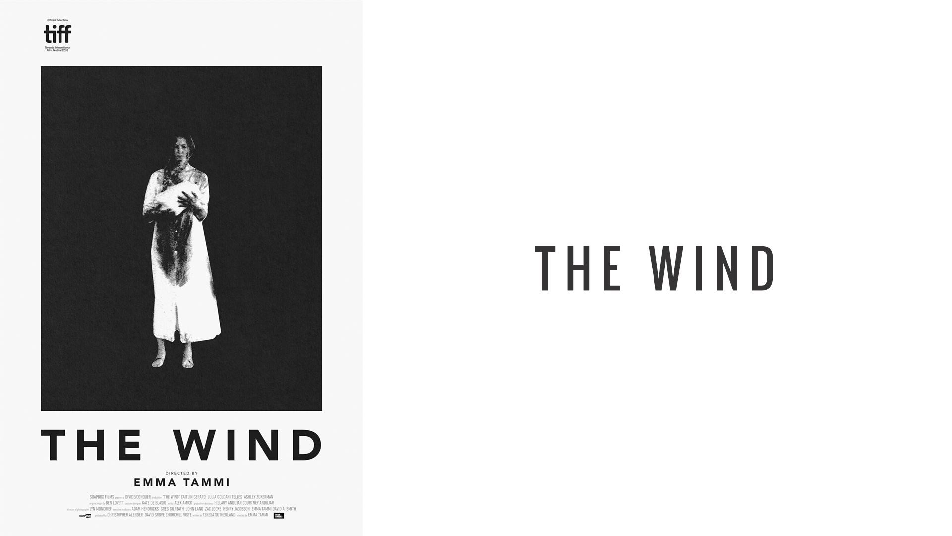
The Wind
The poster for the wind is as stark as it gets. The bold white frame, encompassing the black box, itself surrounding the figure at the center dressed in white makes the composition feel almost telescopic as if we are descending into it. Speaking of the figure, though she occupies the center of the poster and is where your eye is naturally drawn, she is blurry, which lends the image the impression of a lithograph. So, while the composition itself feels uber-modern, this lithographic impression aligns aesthetically with the film’s rural frontier setting. The blood that stains the figure’s nightgown causes her to blend into the darkness around her, almost as if she’s being consumed by it, and the darkness serves as a stark stand-in for the vast openness of the prairie — a sublime landscape that inspires both awe and paranoid fear. The bold, black title under the image, rather than a disruption, almost feels like an extension of that feeling of all-consuming fear. This poster earns high marks for how much it communicates with such a simple design.
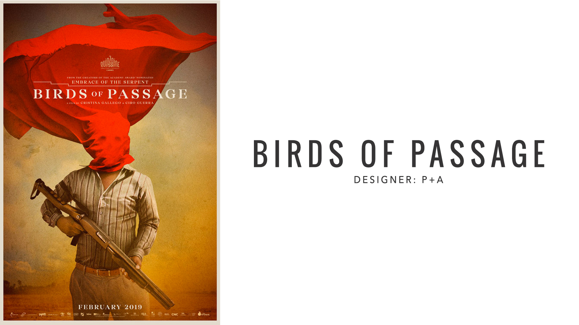
Birds of Passage
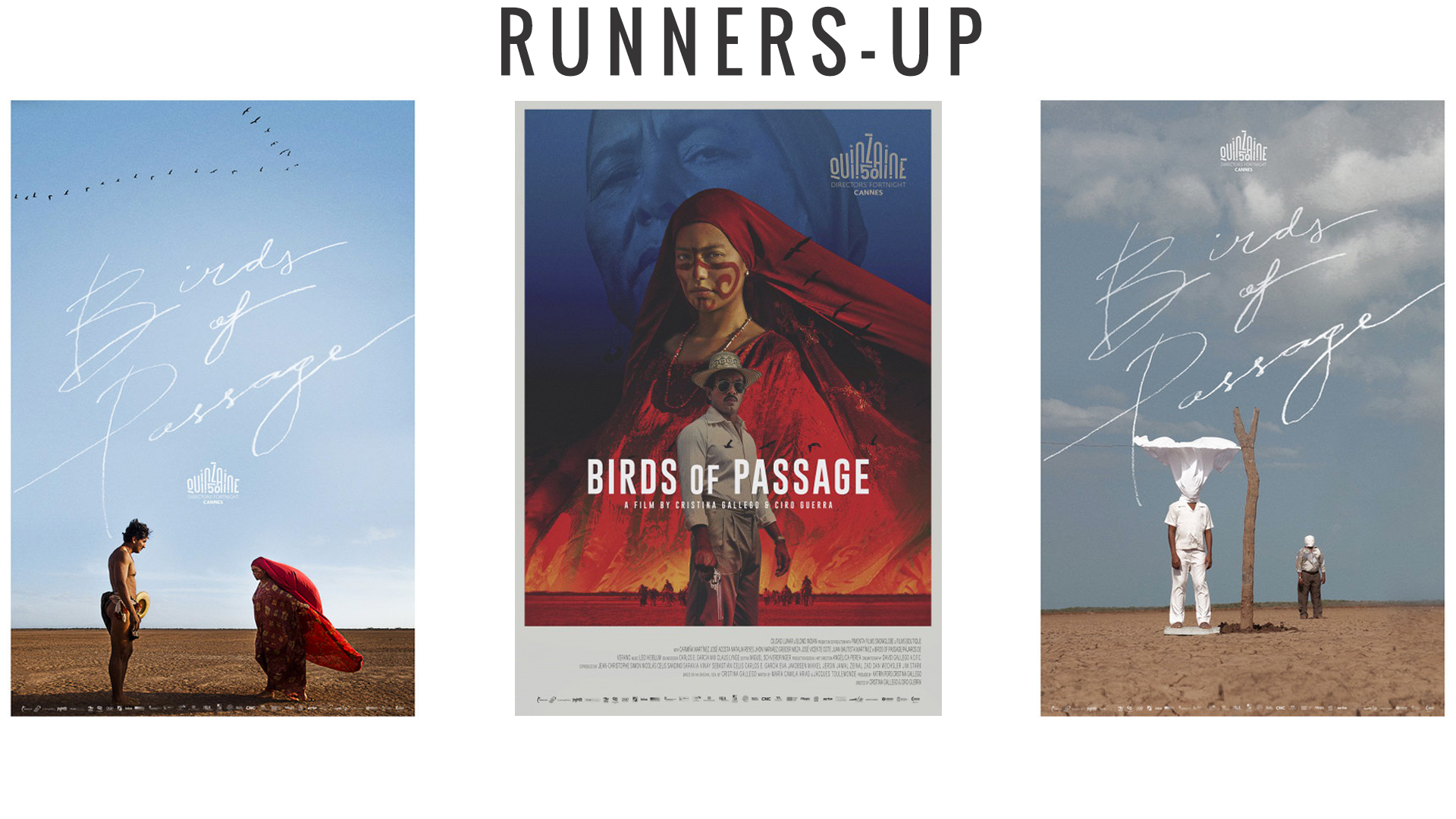
The use of red in these posters gives off a serious Tarsem Singh vibe, and that’s a good thing! While the trailer seems to ground this movie more in reality than fantasy, there is an air of mysticism that runs throughout these posters. In this particular version, the red cloth covering the man’s face could have many cultural and aesthetic meanings — for example, some cultures cover their heads or faces so that God cannot see them. It also recalls a veil, which, combined with the sanguine color of the material, heavily implies the period of mourning following bloodshed and death. The impression of a skull beneath the cloth paints the figure (who dominates the frame) as both a victim and grim reaper. This, coupled with the fairly large firearm in his hands, speaks to the violence of the story. The background is washed out, allowing the bright red to feel crisp in comparison, while also speaking to the arid climate where the story takes place. We loved these posters so much we couldn’t include just one; check out the runners-up below to see the rest.

