[Editor’s note: This is the seventh entry in our ‘Video Evidence’ series on the Oscar race. For the complete list of ‘Who Really Deserves to Win’ essays, visit our Oscars 2015 landing page.]
What do you look for in great cinematography? Technical mastery? Originality and innovation? The expression of a movie’s meaning or an artist’s vision? Or something else?
Continuing our annual video examination of Oscar-nominated cinematography, let’s watch one to two minutes from each of the five nominees for this year’s Oscar for Best Cinematography. The soundtrack will be removed from the clips. Instead, we’ll have some commentary (posted below). But you might want to watch the clips with no sound at all. See what great cinematography means to you. (Also check out our past videos on the 2014 and 2013 cinematography nominees.)
Just for kicks, let’s also turn the three criteria listed above into a scoresheet for the nominees, with each criteria ranked on a comparative scale from 5 (most impressive) to 1 (least).
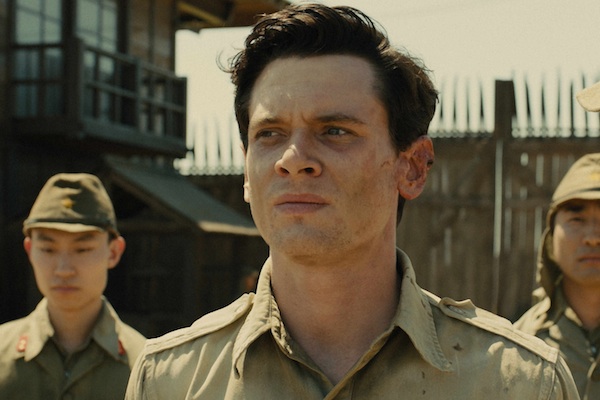
Unbroken
Director of Photography: Roger Deakins
This scene of a track meet looks like it’s shot like a regular sports movie, with mobile cameras smoothly following the action. It’s actually as much camera movement as we see in Undefeated, which generally is a statically composed film. But what stands out for me is the contrast in visual moods when we cut between the race and Louis’ family listening to it at home, with these rich orange hues that convey the warmth of the family, with a fiery sense of passion. Contrast that with the shots of the race, which feel lighter, more sterile and impersonal, with a color palette that favors skin tones. In fact, most shots in the movie seem to have a washed out quality, since most of the movie takes place under punishing conditions of heat and sunlight. And many scenes seem to have a single dominant color scheme, like the dusty hue of this prison camp scene. This scene takes place under unforgiving sunlight, but notice how the use of light can bring dramatic subtext to this scene. Because of where the light is positioned, the Japanese officer looks like he’s shaded, while Louis and the American soldiers are squinting at the sun. Monochrome color schemes and lighting of intense brightness are the defining qualities of this film’s cinematography.
Technical mastery: 4
Originality and innovation: 2
Expression of meaning and vision: 4
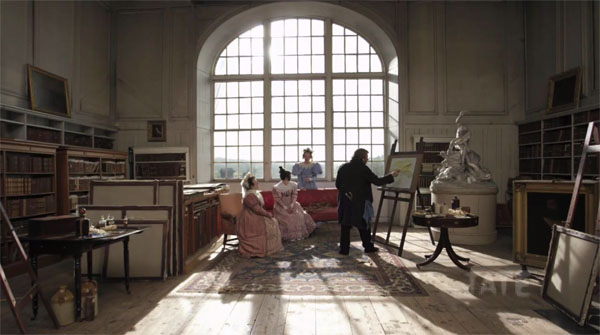
Mr. Turner
Director of Photography: Dick Pope
Look at how this shot uses camera movement to bring dynamism to 19th-century London and to the film’s title character. I love the haze around the ceiling windows, the kind you find in old cathedrals, that gives the setting a hallowed quality. And the deep focus makes it possible to see details in just about every painting, whether the camera is far or near to them. The filmmakers also consciously reference famous paintings from the period, and their ability to evoke them seems almost too good to be true. These compositions look like they were rendered in CGI. These clips are pleasurable but a little bit show-offy; I prefer it when cinematography can convey a genuine sense of dramatic discovery, like in this scene, when Mr. Turner is suddenly struck by a moment of beauty with Mrs. Booth. Here you can see why he’s so taken by surprise: the depth and abstract beauty of the sails in the background, the warm light filling the room casting Mrs. Booth with a divine glow. And when we cut to a close-up, the transcendent beauty of that moment is gone, but the inner beauty of Mrs. Booth remains, for Mr. Turner and for the viewer.
Technical mastery: 5
Originality and innovation: 4
Expression of meaning and vision: 5
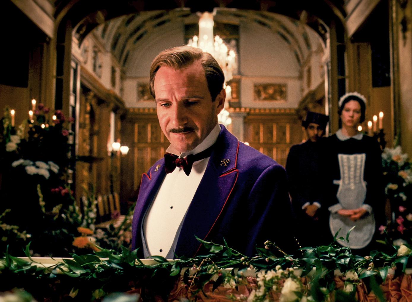
The Grand Budapest Hotel
Director of Photography: Robert Yeoman
Unlike the first two films, The Grand Budapest Hotel is shot in a 4:3 aspect ratio. It’s a more square frame that the film plays up with its boxlike visual design, giving the film a pressurized quality. The shots in are certainly attractive and meticulously composed. But I have to wonder how much of the credit should be given to the production design, which is so full of visual splendor. A lot of the film’s visual pleasure is also due to its rigid geometrical compositions and movements, straight tracking shots across, forwards or backwards. It’s nice to watch, but as camerawork goes, it seems pretty straightforward, sort of what you expect from Wes Anderson. It’s in the less dynamic moments that I can admire more of how the film uses lighting to get just the right touch of somber daylight into this prison scene, while also capturing all the amazing visual details, the scratches and peelings on the wall, the frayed textures of their prison clothing, and the tattoos and wrinkles on Harvey Keitel’s body.
Technical mastery: 4
Originality and innovation: 3
Expression of meaning and vision: 4
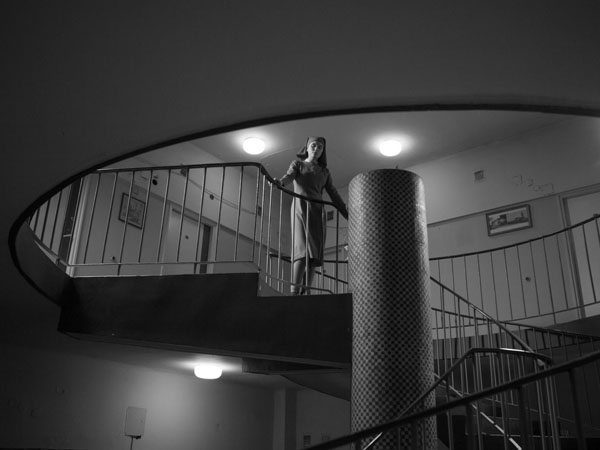
Ida
Directors of Photography: Lukasz Zal and Ryszard Lenczewski
Like Grand Budapest Hotel, Ida is also shot in a 4:3 aspect ratio, meant as a tribute to the Polish films of the 1960s, the place and period where this story is set. This scene is set in a convent, which you would assume to be a cloistered, confined space. But notice how open it looks. The low position of the figures and the distance in both this shot and the reverse shot creates a sense of space between and around the characters, which I think is key to the feeling of mystery that pervades this movie. Even in this close-up shot, we feel something hovering in the space between us and this character. This nightclub scene shows off a more lively atmosphere, but the sense of cool distance remains. Again, we see the use of negative space and medium length lens creating space around the character, even as the shallow depth of field separates her from her surroundings. This reverse point of view shot preserves the distance, but it also expresses a feeling: Ida’s sense of being drawn to the jazz musicians and their world. Ida is a stunning showcase of how much you can express without even moving the camera, relying almost entirely on framing and depth of field to create vast dimensions of expressive space.
Technical mastery: 5
Originality and innovation: 4
Expression of meaning and vision: 5
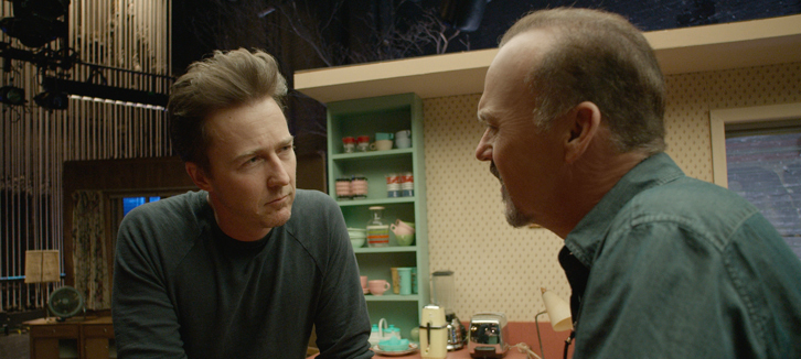
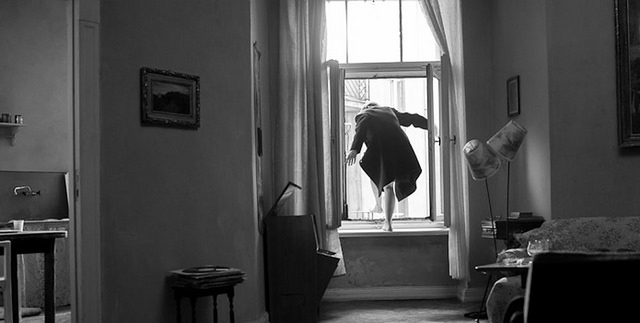
Birdman or (The Unexpected Virtue of Ignorance)
Director of Photography: Emmanuel Lubezki
Compared to Ida, Birdman is a more bombastic display of camerawork, presented as a single continuous shot that runs for the movie’s entire two hours. But underneath the gimmick, there’s a lot of dexterity and subtlety to how the cinematography steers the dramatic properties of a scene. Here the lighting spotlights Emma Stone’s character as she’s being discussed by the two male leads, while the framing of their bodies sandwiches her. But then this pan to the left creates a two shot that shifts the focus to the dynamic between Stone and Edward Norton. This sudden wheeling turn indicates a kind of transition happening, and sure enough, Stone and Norton walk offstage under a deep blue light that reinforces the sense of entering a new space, both physically and dramatically.
This scene serves a basic expository purpose: Michael Keaton’s character is being interviewed by reporters. But the camera is able to enter this space and shape its dramatic dimensions, moving gradually from a two shot with the reporter, to a single close-up of Keaton that changes the emphasis on how he’s struggling with the interview. There’s been a lot of talk about how the Steadicam moves constantly through the spaces of this film in a flashy display of virtuoso technique. But attention should be paid to moments like this one, where the camera lets us linger on a close-up of Keaton’s and ground us in his presence. It creates a momentary window into his subjective state before pushing us back out into the merry-go-round of madness that surrounds him.
Technical mastery: 5
Originality and innovation: 5
Expression of meaning and vision: 5
Kevin B. Lee is a filmmaker, critic, video essayist and founding editor of Keyframe. His video essay Transformers: The Premake will screen at the 2015 International Film Festival Rotterdam and the Berlinale International Film Festival Critics’ Week. He tweets at @alsolikelife.