[Editor’s note: This is the fifth entry in our ‘Video Evidence’ series on the Oscar race. For the complete list of ‘Who Really Deserves to Win’ essays, visit our Oscars 2015 landing page.]
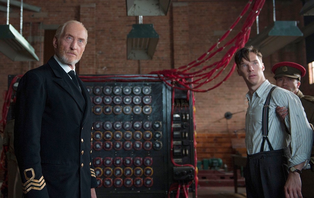
The Imitation Game has a great built-in metaphor for judging the quality of directors. How do we tell the difference between something that feels unique and real instead of mechanical and phony?
At first I thought Morten Tyldum was a pseudonym for Harvey Weinstein, because The Imitation Game is a textbook Weinstein Company directing job, moving mechanically through an appealing storyline, pretty production design and bland expository dialogues. It’s the kind of prestige picture that feels programmed by a computer. This is made clear in one scene where we see Alan Turing’s code-breaking machine churning away while the Nazi war machine rolls forward. The shots are supposed to pit Turing’s machine against the Nazis, but instead, it blends them together as if Turing and the Nazis are working as part of one machine. And this is exactly what’s happening with the directing: Tyldum’s job is to lay a smooth, continuous rhythm for the viewer, lulling them into a stupor with the film’s impersonal aura of “quality” cinema.
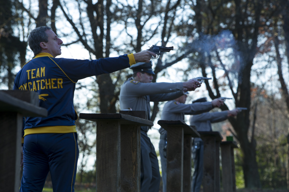
Bennett Miller is another prestige picture maker, but with Capote, Moneyball and Foxcatcher, he’s developed a personal style that explores themes of masculinity and success. In Foxcatcher he pushes that style further by relying on minimal dialogue and putting the focus squarely on the spaces between his actors to convey dramatic tension. It’s subtle, resourceful and leaves room for interpretation. At the same time, this ambiguous deadpan approach can feel a bit stiff, and it gets undermined by heavy-handed imagery that spells out the movie’s take on America. There’s a strange irony to the directing: for a movie that seems critical of millionaire John DuPont, the film’s style seems to take cues from his cold airs of self-seriousness.
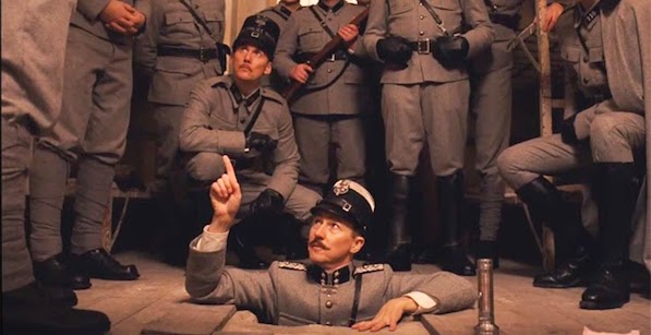
One of the signature deadpan directors of our time, Wes Anderson applies his straight-faced but playful style of comedy to his darkest material to date in The Grand Budapest Hotel. Over the years Anderson has created a vast, distinctly personal cosmology of images driven by a uniquely musical directing style. Energetic editing and dialogue scenes propel the rhythm of his narrative forward from one ornate shot to the next. While I respect how he’s developed his cinematic idiom with increasing intricacy and polish, I can’t help but feel suffocated by the constant flat planes and symmetrical framing. These days Anderson’s style inspires viral video clickbait and legions of film school imitators, but to me these ripoffs amount to an indictment of how predictable his formal strategies have become.

It’s much harder to ascribe a distinct visual signature to the films of Richard Linklater. As acclaimed as Boyhood may be, on a visual level it’s the cinematic equivalent of normcore, which doesn’t speak in his favor. But the normalness of his visuals help point to where his obsessions really lie. This scene looks like a pretty standard dialogue scene filmed with shot reverse shot techniques, relying on the dialogue to convey meaning and the actors for feeling; the staging, cinematography and production design play a neutral, almost negligible factor. But the subtle power of Boyhood isn’t what’s in the scenes but between them: transitions between each year, where it isn’t clear that we’ve entered a new year until we’ve accumulated enough details to register the change in time. Boyhood is the hardest to point to the directorial craft found in a single scene. It’s greatness is really in the steady accumulation of seemingly ordinary details until they achieve the weight of history.
Assessing the direction of each of these films depends on what feels obvious and what feels subtle, and of course these judgments differ for each viewer. For me, no film encompasses the obvious and the subtle more than Birdman. The concept of filming a movie in one continuous shot sounds like a big gimmick, and the story of a washed up action star seeking a comeback on Broadway is rife with show biz clichés. But it’s Alejandro González Iñárritu’s direction that that transforms these concepts into a highly expressive cinematic experience, one that reflects the mental state of its main character as he fights his way through a gauntlet of challenges.
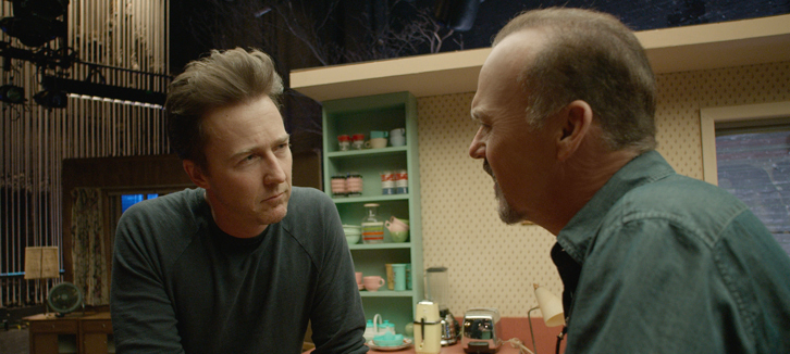
The direction also explores how characters flow in and out of space while affecting each other through their encounters. Space is used for dramatic effect, like this scene where Ed Norton enters the production and dazzles Michael Keaton’s character–we don’t even need to hear the dialogue to sense the shifting dynamic between the two. First, the camera favors Norton by following his movement. As he draws away, the camera keeps drawing near, extending the approach towards him. Then there’s a quick pan to Keaton, as if it’s trying to pull him back into the scene he’s been pushed out of. The scene goes on for three more minutes, too long to fit inside a neat little viral video, but long enough to let their relationship continually unfold with each unique instance of time and space. Concepts like shot and reverse shot get stretched out and played with, with one long look at one character gradually shifting into the other. This isn’t just gimmicky filmmaking, but an exploration of how a certain technique can push cinematic expression into new territory.
In his past films, Iñárritu’s films suffered from prestige picture seriousness and dialogue heavily underlining his points. With Birdman, he’s elevated his artistry with light, satirical touches, meaning created through style, and camera that is constantly exploring the dramatic potential of one space after another.
Kevin B. Lee is a filmmaker, critic, video essayist and founding editor of Keyframe. His video essay Transformers: The Premake will screen at the 2015 International Film Festival Rotterdam and the Berlinale International Film Festival Critics’ Week. He tweets at @alsolikelife.


